nossa montagem
Brand repositioning for a furniture assembly company going through a phase of growth.
00

Context
Nossa Montagem is a company specialized in furniture assembly, disassembly, and installation. With an established operation and plans for growth, the company needed a visual identity that better reflected the reliability and quality of its service.
Problem
The existing identity did not communicate the level of reliability and security expected from the business. The visual communication was also inconsistent across different touchpoints, making it difficult to build a strong and recognizable presence.
Creative Direction
The new identity was designed to communicate reliability, professionalism, and approachability, while keeping the brand simple and easy to recognize.
Concept
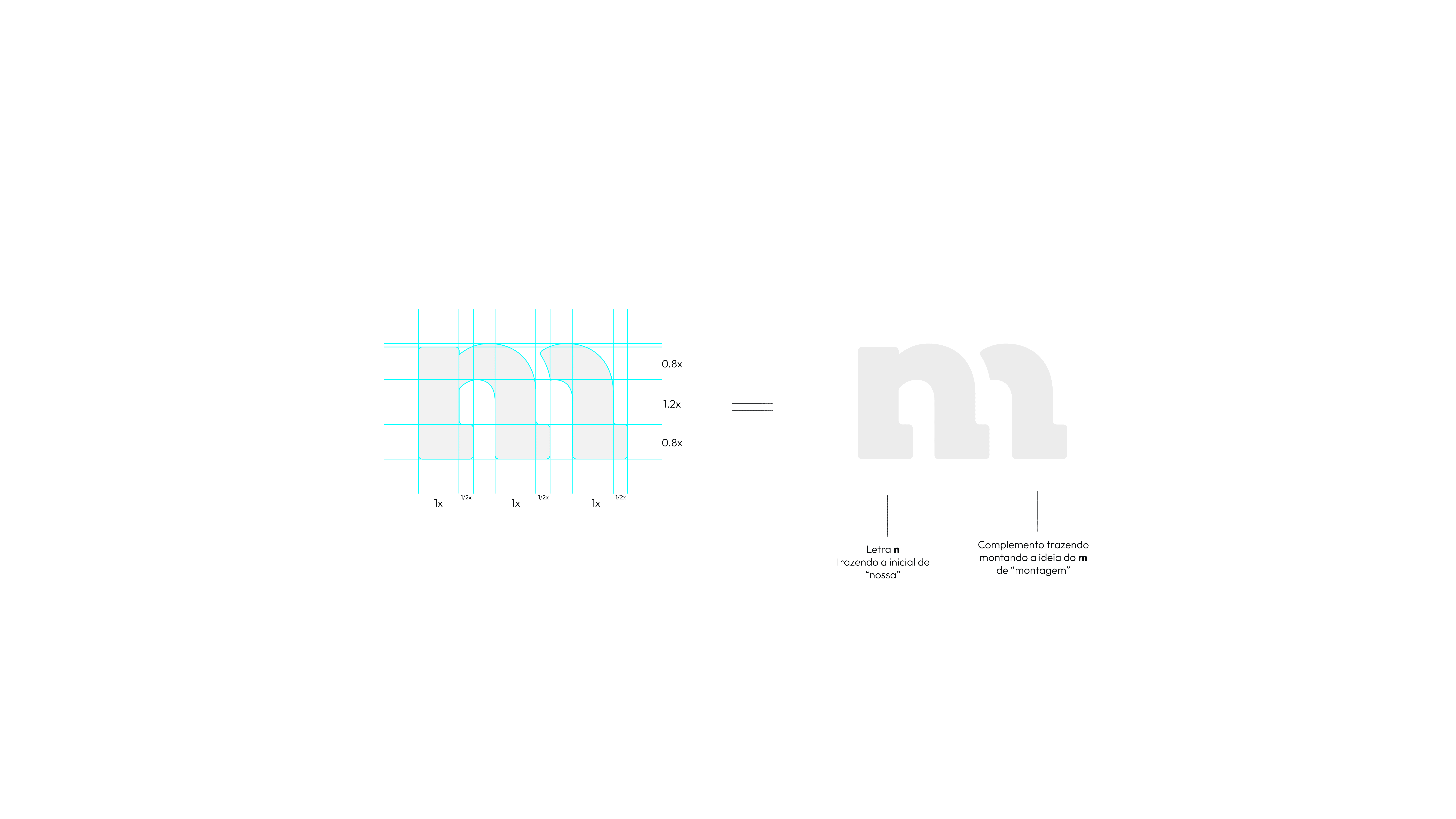
The central idea behind the logo was to combine the letters “N” from Nossa and “M” from Montagem into a single symbol.
This creates a direct connection between the two words while giving the brand a distinctive visual asset that can work independently from the full logo.
Color & Typography
Purple was selected to communicate calmness, respect, and confidence.
Yellow introduces warmth, optimism, and energy, creating a balance between professionalism and approachability.
The Choplin typeface was chosen to complement the identity with a strong and distinctive typographic presence.
Applications
The visual identity was extended into a complete website, from navigation structure to the final interactive prototype developed in Figma.
Outcome
The identity was approved by the client and evolved into an ongoing design relationship.
I currently support the brand's visual management across social media, website updates, and future brand applications.
year
2024
tools
Illustrator, Photoshop, Figma, Notion, Jitter
category
Branding & Visual Identity
01
02

03

04

05

06

07

08

09

010

011

012

013
014
015

016

017

018

019